
What Are The Formatting Rules For Minimalist Vs. Text Heavy Networking Cards?
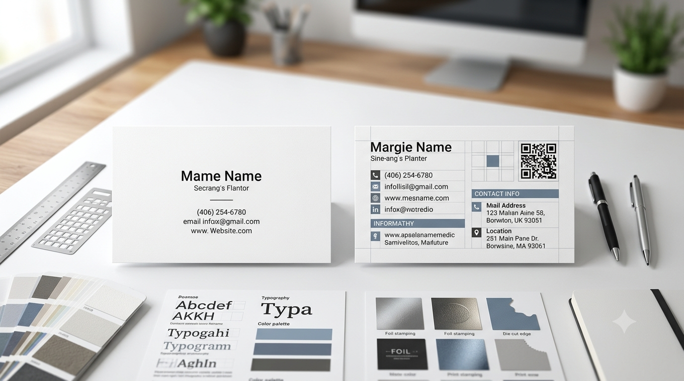
Minimalist and text-heavy networking cards follow very different thinking when it comes to design and spacing. A minimalist card keeps things very simple. It uses a lot of empty space, small amount of text, and clean lines. The goal is quick reading and a clear first impression. On the other side, a text-heavy card tries to share more information in a small space. It may include job title, contact numbers, email, address, social links, and even QR codes.
How Does White Space Change Look At Minimalist Networking Cards?
White space represents empty area placed between text elements and design structure, forming an essential part of a minimalist design approach. White space supports separation of name, job title, and contact details so eye movement becomes easier during the reading process. Without sufficient spacing, small text begins appearing crowded and reading clarity reduces significantly. White space also controls visual breathing room, allowing each section to exist without visual interference from surrounding elements.
Why Do Text-Heavy Networking Cards Need Strict Font Hierarchy?
Text-heavy networking cards include multiple information layers, therefore font hierarchy becomes necessary for organizing reading flow in a structured way. Font hierarchy defines arrangement order where name receives highest visual priority, followed by job title and then supporting contact details. Equal font size across all information creates confusion because reading direction loses clarity and viewer struggles to identify starting point. Differentiated font sizes and weights guide eye movement naturally across content structure.
What Is A Normal Size Of A Card And Why Does It Matter?
The normal size of a business card is important because it affects how everything fits inside the design. A standard business card size is usually 3.5 x 2 inches. This size is widely used because it fits easily in wallets, card holders, and pockets without bending. You can also read more about it here: What is the normal size of a business card? When designers work within this size, they must carefully plan spacing, font size, and layout. In minimalist cards, this size feels spacious and clean. In text-heavy cards, it feels tight and requires careful alignment.
How Do Margins And Alignment Control Readability In Networking Cards?
Margins refer to space surrounding content edges while alignment refers to directional placement of text across layout structure. Both elements control readability by guiding visual flow and preventing cluttered appearance. Minimalist cards usually apply wider margins to create open structure that supports clean visual separation between elements. Text-heavy cards reduce margin space slightly to accommodate additional information while maintaining controlled structure.
Why Does Color Choice Affect Minimalist And Text-Heavy Card Rules?
Color selection influences readability and information separation across networking card designs since visual contrast directly affects text recognition. Minimalist designs generally use limited color ranges such as black, white, and grey to maintain focus on written content without distraction. Text-heavy designs may introduce color variation to separate sections such as name, contact details, or branding elements, although excessive color usage reduces clarity and creates visual confusion.
Strong contrast between background and text ensures readability under different lighting, supporting better visibility during real-world usage.
Brand consistency across materials remains important because unified color approach strengthens recognition across packaging and printed materials. Many businesses working with UPacked maintain controlled color systems to ensure consistent presentation across all communication formats.
How Does Typography Style Influence First Impression On Networking Cards?
Typography defines the visual structure of written communication and directly affects the first impression formed during card interaction. Simple font styles often support readability in minimalist layouts because clear shapes allow quick recognition of information. Text-heavy layouts may combine multiple font styles, although controlled usage remains necessary because excessive variation creates visual imbalance and reduces clarity across content structure.
Printing specialists like UPacked often assist in typography selection so final design aligns with business identity while maintaining readability standards across both simple and detailed information layouts.
Why Is Information Placement So Important In Text-Heavy Designs?
Information placement refers to positioning of each content element within card layout so reading order remains organized and predictable. Name placement receives highest priority positioning, followed by role description and then supporting contact details. Random placement of information leads to confusion because viewers cannot identify logical reading sequences, which reduces communication efficiency. Structured layout divides available space into defined sections so each information category maintains a dedicated area.
How Do QR Codes And Digital Links Affect Modern Card Layout Rules?
QR codes introduce digital access points within physical networking cards, allowing direct connection between printed information and online profiles. Minimalist layouts often replace extended text links with QR codes to reduce visual clutter and maintain simple structure. Text-heavy layouts may include both QR codes and written contact details, although careful positioning remains necessary to prevent overcrowding within limited space. Corner placement is commonly used because surrounding empty space supports scanning functionality without interference.
Why Do Minimalist Cards Focus More On Emotional Impact Than Information?
Minimalist cards prioritize impression-based communication rather than detailed information delivery, allowing viewers to focus on identity recognition instead of extensive data reading. Reduced content volume increases memorability because fewer elements compete for attention. Visual simplicity supports faster recognition since eye movement follows fewer elements across layout structure.
Text-heavy cards focus on complete information delivery, while minimalist cards focus on selective communication that encourages further digital interaction. Curiosity often increases when limited information appears, leading viewers toward scanning QR code or visiting online profiles for additional details.
How Do Printing Materials Support Different Card Layout Rules?
Material selection influences appearance, durability, and readability of networking cards because surface quality affects ink absorption and text sharpness. Thick paper materials maintain structural stability while supporting consistent printing results across both minimalist and text-heavy layouts. Minimalist designs often use smooth surface finishes that support clean visual appearance, while text-heavy designs require high clarity printing surfaces so smaller text remains readable.
Ink quality plays an important role in maintaining sharpness of printed content because low-quality ink reduces definition and affects readability of detailed sections. Surface finishing such as matte or light gloss changes visual perception of text contrast and background interaction.
What Future Trends Are Changing Networking Card Design Rules Today?
Networking card design continues evolving due to integration of digital systems, environmental considerations, and changing communication patterns. QR-based access systems reduce dependency on printed text while increasing connection speed between physical and digital information.
Printing services like UPacked support the adaptation process by aligning traditional printing standards with modern design requirements while maintaining clarity and usability across networking materials.

 English
 Arabic
 French
 Spanish
 Portuguese
 Turkish
 Dutch
Dutch
 Italiano
 Russian
 Romaian
 Portuguese (Brazil)
 Greek
Greek