
Does a Mosaic Surface Open Up a Small Bathroom or Close It In?
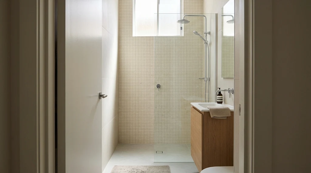
A compact bathroom reads differently depending on how much contrast its surfaces carry. Pale pieces with pale joints behave like a single plane; dark joints break that plane into a visible grid. The stopping point matters just as much as the tone. A pattern with nowhere obvious to end will keep pulling the eye.
Many people assume a dense small-format layout automatically opens a space up. Mosaic tiles achieve that when the surface stays quiet from the entrance to the back wall. They can shrink the same room just as quickly when every edge competes for attention. Tone, contrast, and endpoints decide which way the result goes.
Stand at the door before committing to anything. One room puts the shower wall in the first line of sight; another opens onto most of the floor. Equal coverage produces unequal impressions in those two settings. Judge every option against that first view.
Nothing here requires a dramatic decision. Softer joints or a moved stopping point often shift the feel more than a change of piece size does. Fix the viewing point first and the remaining choices fall into place more easily.
How the lines between pieces shape what you see
On display, a sheet often looks almost plain. Loose pieces sit edge to edge with nothing dividing them, so the board understates what happens once the wall is finished. A tile shop counter rarely shows a panel that has actually been grouted. Ask whether one exists; that comparison settles more questions than a dozen loose sheets.
Once the joints are filled, every unit is outlined. Across a full wall those outlines can become the dominant feature, particularly with small squares or penny rounds. A modest bathroom may contain hundreds of joints, and the eye counts them whether you want it to or not.
For a more open read, start with a joint colour close to the piece. Warm grey softens the seams beside light grey, while off-white sits more comfortably with cream than bright white does. Match the joint to the dominant tone rather than the brightest fleck. A shade darker than the tile still works when the gap stays modest.
Colour variation inside the sheet complicates the picture. A blend of cream, tan and brown keeps a clear pattern even with beige joints. That combination may suit a mirror surround or a shower niche perfectly. On the largest wall, step back and note whether the field colour or the individual pieces register first.
Reading the room from the doorway
Where the vanity faces the entry, a splashback gives the sink a defined place in the room. A panel that follows the vanity width has an obvious start and an obvious stop. Keep the adjoining wall plain so the mirror, tap, and lights each hold their own area. Attention then stays divided rather than crowded onto one plane.
The far end of the room changes the calculation. A soft finish on the back wall, seen through a clear screen, adds texture while depth remains visible. A high-contrast treatment pulls the eye forward and makes that wall feel nearer. The effect helps a long, narrow plan and works against one that already feels short.
When the goal is depth rather than drama, mosaic tiles suit the back wall well. Keep the field quiet if the room already feels compressed. The treatment that flatters a long corridor can crowd a compact one.
A niche is a bounded stage. Its frame already crops the pattern, so stronger colour or busier shape stays inside those edges. Think about what will sit on that shelf: multicolour behind a row of shampoo bottles reads as clutter in daily use. Assign the strongest pattern to one area and let the rest of the room stay quiet.
When a patterned floor earns its place
Bathrooms with only a sliver of visible floor between the vanity and the shower tend to show overall tone before individual units. There, a tone-on-tone layout blends in without comment. When the whole floor is visible from the entrance, pattern carries far more weight. The plainer the walls, the more that floor can stand alone.
A dark grid or repeating motif can become the loudest element in the room. A dark floor anchors a pale room, yet in a tight plan it can shorten the path from entry to shower. Weigh that trade-off before committing. Tone-on-tone keeps the floor in a supporting role; bold pattern makes it the lead.
Check the range before ordering. A tile shop can confirm whether a piece is rated for wet areas and which drains suit it, and suitability may vary within a single collection. Ask your installer to confirm the choice against your layout as well. Small pieces also add grip underfoot, which matters on wet surfaces.
Where the main floor meets the shower floor, close tones blur the change even when formats differ. Larger warm-grey pieces in the main area can continue into a warm-grey field under the screen. With a quiet threshold, the surface appears to run toward the back wall. A contrasting border would break that illusion.
Tiling an entire wall with small pieces
One continuous field often reads calmer than several bands of the same material. Strips behind the sink, around the mirror, and inside the shower create competing edges. Each edge cuts a plane that might otherwise feel unbroken. Where the pattern stops at the corners, the wall gains a clear beginning and end.
Shape steers the eye as much as tone does. Vertical finger formats lift the gaze on a low wall, particularly with a joint colour that softens the lines. Horizontal layouts stretch a wall sideways instead. A bold horizontal band at eye level can split a short room into two halves and drop the ceiling.
Sheet-to-sheet seams decide whether mosaic tiles cover a whole wall cleanly. Laid side by side, neighbouring sheets often show wider gaps than the gaps within a single sheet. Strongly varied colours can form noticeable patches once the pieces sit together. Have the installer spread a few sheets on the floor before any fixing begins.
Ask for a larger display so those joins show early, then walk to the doorway and look back. Colour drift between sheets becomes obvious at that distance. Plan the termination points with the same care as the main pattern. A field that dies awkwardly mid-plane draws attention to the cut edge.
Checking samples under your own lights
Showroom lamps flatter glossy surfaces, making them look evenly bright from every angle. At home, a spot directly over the wall may hot-spot some pieces and leave others in shadow. That interplay can suit a niche; across an entire wall it may add more texture than you intended. A matt finish gives a calmer plane when the mirror, screen and fittings already return plenty of light.
Take a full sheet home with the grout swatches and the neighbouring tile. Stand it upright for a wall and lay it flat for a floor. Many mosaic tiles sold as one shade still differ between wall and floor versions of the same colour. View the sheet from the entrance with the lights on, then again in daylight if a window exists.
Edges deserve their own check. Hold the sheet against the vanity, the shower screen, or wherever the pattern will stop. A piece that looks quiet alone may show a sharp change against its neighbour. Leave the sample in place for a full day when you can.
Before fixing anything, carry the shortlist to a tile shop for a second opinion under different lamps. Commercial lighting often runs cooler and brighter than a bathroom ceiling light. Compare the sheets side by side there, away from the influence of your own walls. A pairing that pleased you at home may read differently in that setting.
Deciding what should catch the eye first
With the samples judged and the layout settled, one priority usually remains. Decide whether the room should read as a single unbroken plane or a surface with visible texture. That answer sets the joint colour, the tone choice, and how far the pattern travels. Both approaches work in a compact room when the contrast stays controlled.
When the goal is width or depth, choose a finish that stays quiet from the entrance and ends cleanly at the corners. When the goal is character, give the pattern a bounded home such as a splashback or a niche. A final trip with the samples in hand can confirm the shortlist under more than one light source. The longest planes can then carry the eye without interruption.
Judge the finished choice at the entrance, under the real lights, from the distance you actually stand. Leave the samples in place until that reading feels settled. A view from that spot answers most remaining doubts on its own.

 English
 Arabic
 French
 Spanish
 Portuguese
 Deutsch
 Turkish
 Dutch
 Italiano
 Russian
 Portuguese (Brazil)
 Greek