
How to Combine Different Tile Patterns Without Losing Coherence
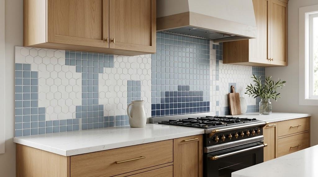
The same wall can read as composed or chaotic, and the difference is usually decided long before installation begins. What tips the balance is rarely the material itself. It is the amount of competition permitted between patterns, colors, and scales.
Mosaic tiles can unify a room or fragment it, and the outcome tracks the discipline of the plan rather than the sheets you admired under showroom lights. This guide follows the sequence that keeps an assembled mix looking deliberate from the first choice to the final joint.
Establish One Anchor Before Anything Else
Chaotic jobs almost always start the same way: someone stands in front of a wall of samples and wants several at once. Inside a tile shop the options are bright, well-lit, and individually persuasive, which makes restraint feel unnatural. Counting is harder than wanting.
Pick one tile before anything else. Just one. That piece becomes the anchor, and every later selection has to earn its place against it. Quiet hexagons, matte squares, and solid penny rounds all anchor well because they occupy space without dominating it.
The anchor typically covers sixty to seventy percent of the field, which means it does most of the visual work. A calm base gives the eye somewhere to settle, and it gives smaller patterns room to register. Once the anchor is fixed, each new sheet is tested against three questions.
Does it clash with the foundation? Does it shout louder than the foundation? Does it pull attention away from a surface that already works? A yes to any of them means leaving the piece behind.
A useful budget for attention is the 60/30/10 split: dominant field, supporting pattern, small accent. Personality lives in the final ten percent. It is also the share most people quietly double until the hierarchy stops reading. Keep the arithmetic visible on paper before it becomes visible on the wall.
Keep the Palette to Three
Color is where assembled schemes unravel faster than any other variable. Four hues can appear disciplined in a styled photograph and restless on a real shower wall. Impose a limit and let the limit do the enforcing.
Work with three colors. One should be a neutral — white, cream, soft gray, or pale sand — carrying the largest share of the area. The second works as support, often a deeper shade from the same family. The third is an accent, used sparingly enough to stay noticeable.
A blue scheme might pair a pale blue field with a navy support and a warm white or brass-toned detail. The three belong to one another, so nothing competes for dominance. Related palettes are also easier to live with than clever ones.
Undertones deserve a second look under daylight. A cool gray beside a warm beige sounds harmless in the abstract, yet on the wall the temperatures pull apart. Compare both samples side by side and drop whichever reads out of place.
Finish shifts perception as much as hue does. Glossy white and matte white are not the same white under identical bulbs. Count finishes as separate entries whenever they differ.
Change the Shape, Hold the Scale
Shape variation keeps a surface from going flat. Uncontrolled variation is what makes one exhausting. When mosaic tiles are assembled from mismatched units, the surface stops reading as a single plane and starts reading as a pile. The remedy is a rule about size rather than taste.
Pair two shapes at matching scale: penny rounds beside small hexagons, or slim strips beside squares of equal height. Because the pieces sit close in size, the eye accepts them as relatives rather than rivals.
Scale gaps break that acceptance. A miniature penny round beside a large-format hexagon leaves one element dominant and the other nearly invisible. The wall then reads as two separate surfaces sharing a room.
Keep contrasts narrow when you introduce them. A square field beside a rectangular layout works when both come from the same material and color. Change one variable at a time so every effect stays traceable.
Orientation supplies variety without new material. Vertical stack, horizontal running bond, and herringbone can all be built from a single piece. Layout alone introduces plenty of motion across a wall.
Let the Joint Do the Quiet Work
Grout is rarely treated as a design choice. In a mixed composition it behaves like half the design. Identical layouts become different rooms once the joint color changes.
Matched grout fuses pieces into one continuous plane. Contrasting grout outlines every unit and lays a visible grid across the wall. Neither approach is wrong; they simply direct the eye toward different things.
Think of the joint as a referee. Across a field of mosaic tiles it can either hold busy patterns to a common edge or let them run against each other. Patterns that share a color but differ in shape are reconciled especially well by a matched joint.
Busy compositions therefore call for quiet grout: light gray, soft sand, off-white. High-contrast lines over two active patterns are noise stacked on noise. Let the pieces carry the message instead.
Cured grout never matches its wet sample. A swatch taken from the tile shop will always read darker than the finished wall. Request a dried sample, or mix a small test batch on scrap board before the installer prepares the full quantity.
Assign a Job to Every Pattern
Nothing should enter a room without an assignment. A pattern with no job becomes clutter, no matter how handsome it looked on the sheet. Write the assignment down before anything is ordered.
A standard arrangement works cleanly: a plain field across most of the wall, a feature band behind the stove or above the vanity, and a simple border framing the edges. The band draws the eye, the field anchors the composition, and the border closes it off. Each element takes exactly one task.
A band of mosaic tiles set behind the stove is a typical feature placement. It holds attention in one zone while the rest of the room stays quiet. Walk the space before purchasing and notice where your eye rests first; that point is where the feature belongs.
Do not add a second feature band in the name of balance. Balance does not require duplication. An accent draws its power from scarcity, and repeating it elsewhere drains that power.
Bathrooms make the principle easy to see. The shower floor is small and ringed by calmer surfaces, so a tighter pattern there reads as deliberate detail. The same energy on the adjacent wall makes the whole room feel crowded.
Bring Samples Into Your Own Light
Showroom fixtures are designed to flatter. Lighting inside a tile shop tends to be bright, even, and cool, which is not what your kitchen provides. Your room probably has warm ceiling cans, one window, and shadowed corners that swallow detail.
Tiles that looked composed on display can look harsh at home. Pale blues may shift toward gray. Warm whites may shift toward yellow. Memory is a poor substitute for evidence.
Bring candidates back and lay them on the actual surface. Wet them, because water changes how color reads. Prop them against the wall and leave them in place for a few days.
Check them in the morning, at midday, and after dark. Two days of living with a sample settles most doubts. If one begins to irritate you during that window, it was never the right piece.
Confirm Before You Order
Run through this short list before placing an order:
- One anchor, one supporting pattern, one accent.
- Three colors maximum, one of them neutral.
- Consistent scale across combined shapes.
- Grout chosen to unify rather than compete.
- A defined job for every pattern.
Take the list with you when you return to the tile shop. A candidate that fails any line gets left behind without negotiation. Compromise at this stage tends to multiply later.
With those decisions settled, the installed surface reads as a planned composition rather than a pile of good intentions. The pieces will behave well under clear rules, and you will have written them before ordering a single sheet.

 English
 French
 Spanish
 Portuguese
 Deutsch
 Turkish
 Dutch
 Italiano
 Russian
 Romaian
 Portuguese (Brazil)
 Greek